It turns out that some of the most well-known logos in the world were designed to indicate something much more than simple beauty. In fact, it seems that in some cases, every line, curve and color has meaning behind it.
Here are 17 famous logos with hidden meanings that we never noticed before. Fascinating!
17. Hyundai
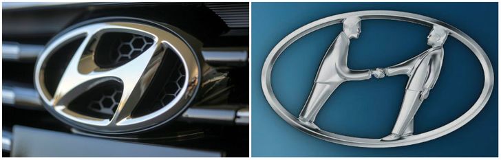
Many people are inclined to think that the logo of the South Korean conglomerate Hyundai is simply the first letter of its name. But actually, the letter ‘Н’ symbolises two people (a client and a representative of the company) shaking hands.
16. Adidas
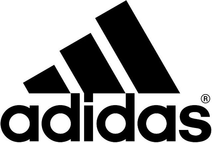
The name Adidas is derived from that of its founder, Adolf Dassler. The company’s logo has changed over time, but it’s always included three stripes. The current configuration is three stripes at an angle which together form a triangle. This symbolises a mountain, which in turn represents the challenges which all athletes have to overcome.
15. Apple
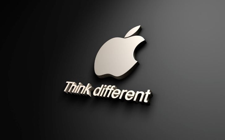
Rob Yanov, the designer who created with the world-famous Apple company logo, has explained how he came up with the idea: ‘I bought a whole bag of apples, placed them in a bowl, and spent time drawing them for a week, trying to break the image down into something simple. Taking a bite out of an apple was part of the experiment, and completely by coincidence I realised that ‘bite’ sounded exactly the same as the computer term ‘byte’.
14. Sony Vaio
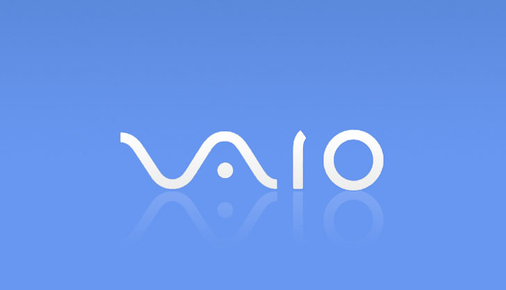
The first two letters of the logo of Sony Vaio make up a wave, which represents an analogue symbol, whereas the last two are similar to the numbers 1 and 0 – that is, symbols of a digital signal.
13. Amazon
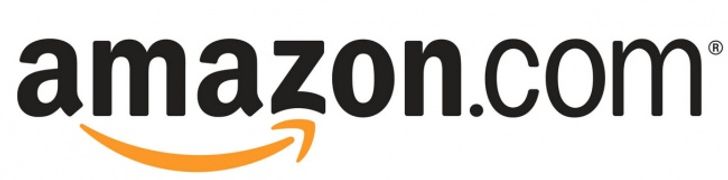
At first glance, Amazon’s logo appears to be nothing special. But it was designed with the philosophy of the company in mind. The orange arrow is similar to a smile, as the company wants its customers to be satisfied. The arrow is also stretched between the letters ‘A’ and ‘Z’, in a hint that the company sells absolutely every product imaginable (‘from A to Z’).
12. Baskin-Robbins
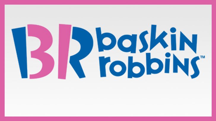
The pink-colored areas of the “BR” part of the logo here make up the number 31, which is the number of different flavors of ice cream that Baskin-Robbins used to famously sell.
11. Toyota
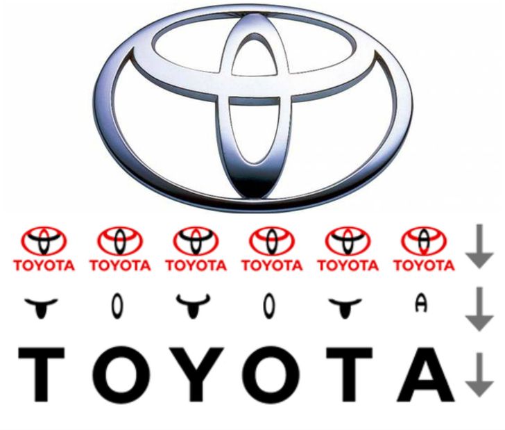
Many people have compared the logo of the Japanese car-producer Toyota to the image of a cowboy wearing a stereotypical hat. But it actually represents a stylised image of the eye of a needle with a thread passed through it. This is a hint at the company’s past – of a time when it used to produce weaving machines. At the same time, the individual parts of the logo also spell out the letters of the company’s name.
10. Continental

Continental, a famous producer of car tires, has a logo in which the first two letters depict the wheel of an automobile.
9. Formula 1
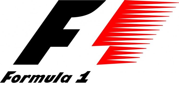
If you look carefully at the white space between the letter ‘F’ and the red stripes in the Formula 1 logo, you can see the number 1. The red stripes of the logo are also meant to be a graphical representation of the speed achieved by Formula 1 cars.
8. Pinterest
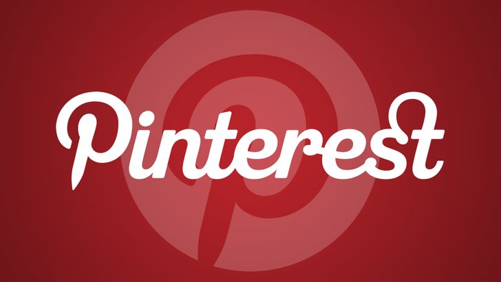
The logo of the popular internet site Pinterest, which people use to collect images they like from across net and ‘pin’ them to their online notice board, has the image of a pin hidden in the letter P.
7. Beats
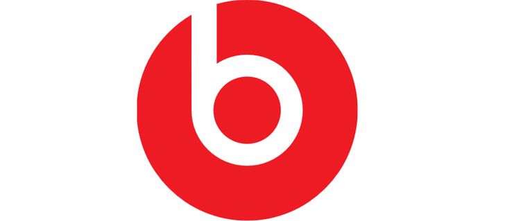
Beats, a producer of audio equipment based in the USA, uses a logo in which the letter ‘B’ looks like a person wearing headphones.
6. Toblerone
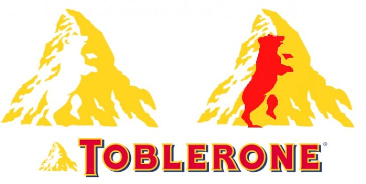
Toblerone, the famous chocolate company based in Bern, Switzerland, includes a silhouette of a bear in its logo, on account of the fact that Bern is sometimes called a city of bears.
5. BMW
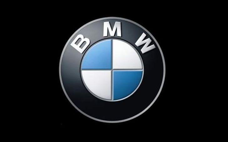
It’s often supposed that the central part of the BMW logo symbolizes the rotating blades of an airplane, in line with the company’s early history of aviation technology, but it is in fact simply a part of the Bavarian flag – the area of Germany where the company originated.
4. LG
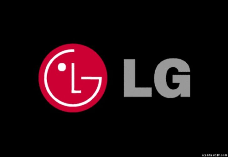
The logo of the South Korean electronics company LG is a stylized image of a person’s face. According to the company, this represents its aspiration to maintain ordinary, human relations with its customers.
3. Evernote
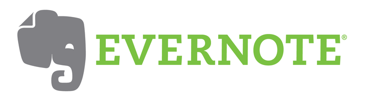
Elephants are known for having impressive memories, including their ability to remember both faces and events. It’s for this reason that Evernote, a note-taking application, uses an image of the animal as part of its logo. The corner of the elephant’s ear, moreover, is folded over – in the same way that people often fold the corner of a page in a book to make note of what point they’ve read up to.
2. Coca-Cola
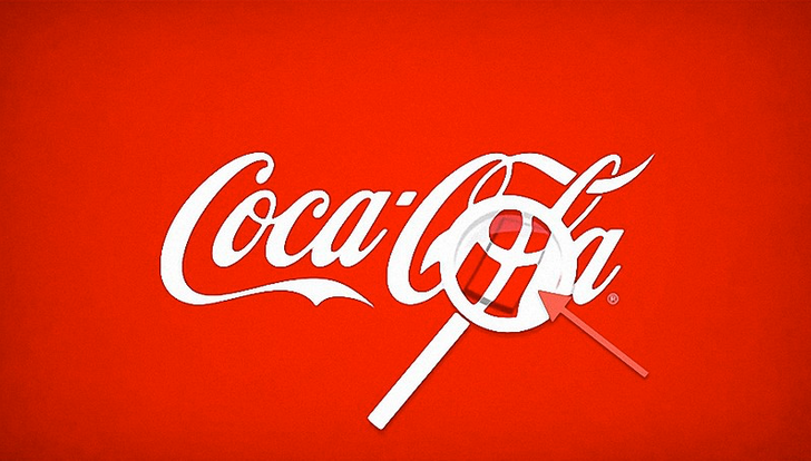
In the world-famous logo of the Coca-Cola Company, in the space between the letters ‘O’ and ‘L’, one can clearly see the Danish flag. Purely a coincidence, the company has nevertheless used this as part of it’s marketing campaigns in the Scandinavian country.
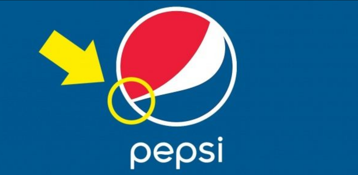
1. Pepsi
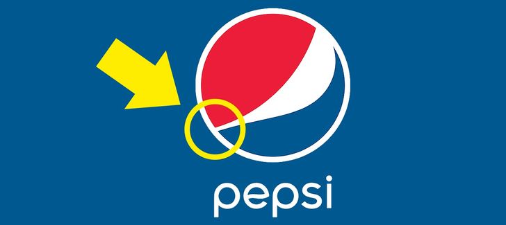
It’s hard to believe, but Pepsi paid over a million dollars to create this special logo with its secret meanings. The new special design hints at mysterious and secretive themes, such as the Earth’s magnetic field, Feng shui, Pythagoras, geodynamics, the theory of relativity, and the golden ratio. The designer has explained that this logo also makes reference to the Mona Lisa, the Parthenon, and even René Descartes. The red, white and blue colors have always represented the American flag.